Plan for an ever-changing day with To-day.
Let’s face it, most of the time our days don’t go as planned. Some things end early, others run late. Things come up suddenly and plans can be canceled at any moment. Traditional day planning methods don’t account for life’s fluid behaviors. Of course, you could erase your written schedule, but eventually, you end up with a hole in the paper. And a calendar app is great, but scheduling every single task of your day can be time-consuming and when plans change, you have to spend even more time editing your calendar. To-day is designed to avoid these pain points. From a library filled with everyday tasks to a built-in to-do list, To-day is sure to be your new favorite day planning app.
Target Audience.
To-day’s target audience is wide: it is anyone who uses a day planning app. More specifically, it’s students, professionals, and parents, with an age range of 18-60 years old.
Deliverables.
UI/UX Research
Mobile App Design
Research
My Personal Experience
It is hard to schedule length-based tasks in current day planning apps, as they are flexible (unlike rigid start-to-end time-based events) and you aren’t able to see your current schedule when attempting to place them.
Most current day planning apps do not allow you to keep a to-do list in the same app. In apps that allow you to create a to-do list, such as Notes, the only way to prioritize one task over another is to type them in the order of priority, which might be difficult initially.
Because of these struggles, I use a physical day planner, but it reflects similar issues of its digital counterpart. While you are able to see the entire schedule while penciling in length-based tasks, the flexibility is limited as eventually erasing will leave a mark. The to-do list section mimics the prioritization issue of mobile apps. The added difficulty of a physical planner is remembering to schedule (as nothing reminds you), remembering to bring it with you (as it is another thing to carry and may not fit in a purse), and remembering to do the tasks you wrote out for the day (as once again, nothing reminds you).
Statistics
Survey Insights
With the survey I created, I collected 60 responses from mainly working professionals and moms. Results showed that most people are not completely satisfied with their current day planning apps.
Competitor Analysis
Samsung Calendar
While the Samsung calendar app is aesthetically pleasing and clear-cut, it does have a few shortcomings. It lacks a to-do list, it is hard to find the individual day view, and accidentally stumbling across the drag-and-drop feature can leave your schedule messed up, as it lacks an undo button.
Google Calendar
Featuring cute graphics and the ability to switch between different calendars for different purposes, Google’s calendar app was the second most-used app according to my survey data. While it does a lot of things right—like its pleasing way of selecting the time—lacks a to-do list, doesn’t advertise it’s drag-and-drop feature, and has too many options when creating an event.
Cozi Family Organizer
The Cozi app was mentioned in my survey results, and it has the potential to be great for families as it includes everything from meal planning to individual and shared to-do lists. Unfortunately, there is a paid version, leaving non-paying users with ads and missing features. There is no drag-and-drop feature, the app is not visually pleasing, and it’s not intuitive to use. With these downsides, there doesn’t seem to be a reason to use this app over free alternatives like Google and Samsung.
Wireframes
User Testing Results
There was difficulty with my initial paper prototype. With it being paper, it was quite difficult to communicate the drag-and-drop task feature, as well as time bumpers.
My original thought was to have a daily to-do list. User testing showed me that having a running to-do list is better as some tasks bridge over multiple days.
The idea to make the decision of moving tasks up a setting instead of an option after the completion of each task was brought up.
The idea of a greater application response when users complete a task was born: the confetti animation.
The App
Creating a Start-to-End Task
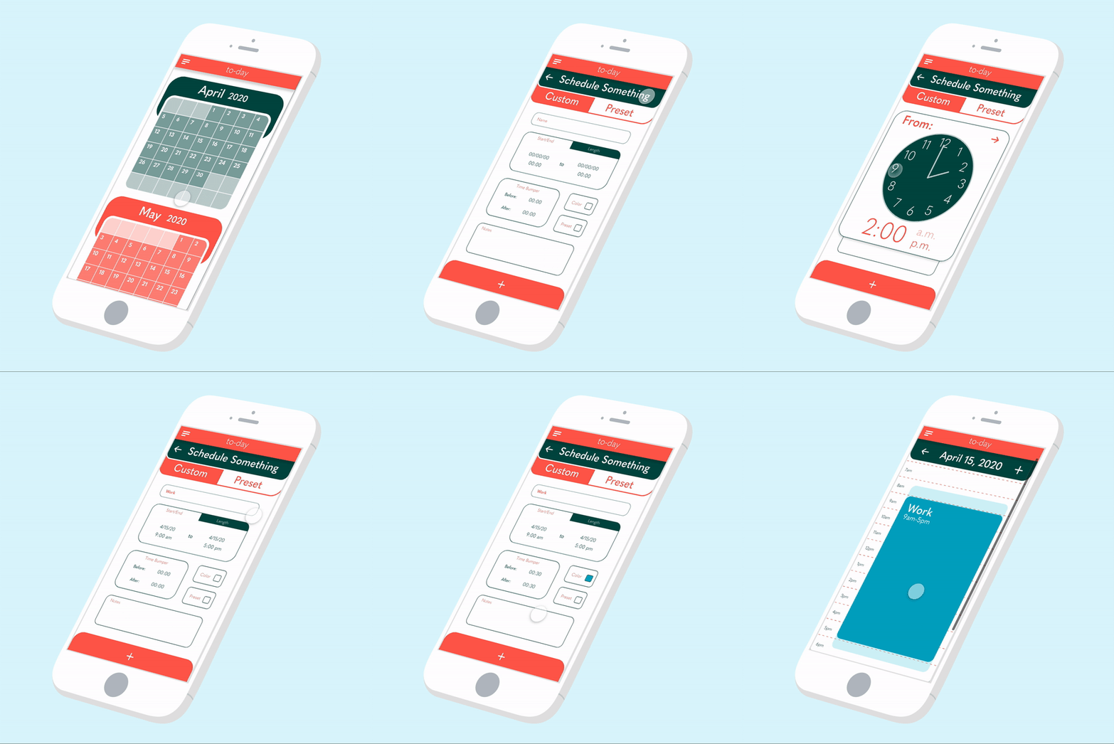
Welcome to To-day, your new intuitive day-planning app. When first opened, you land on the calendar screen, where you have a full view of the month. This main calendar screen boasts the ability to tell you how busy you are each day, as the box for the day will darken as you add more tasks and events. Clicking on a day will take you to an hour-by-hour view. A unique feature of To-day is the ability to add time bumpers, semi-transparent blocks around your event that block scheduling, in order to account for things such as your commute. As you may notice, start-to-end time-based tasks are locked into a time and aren’t able to be dragged and dropped.
Using the Preset Library
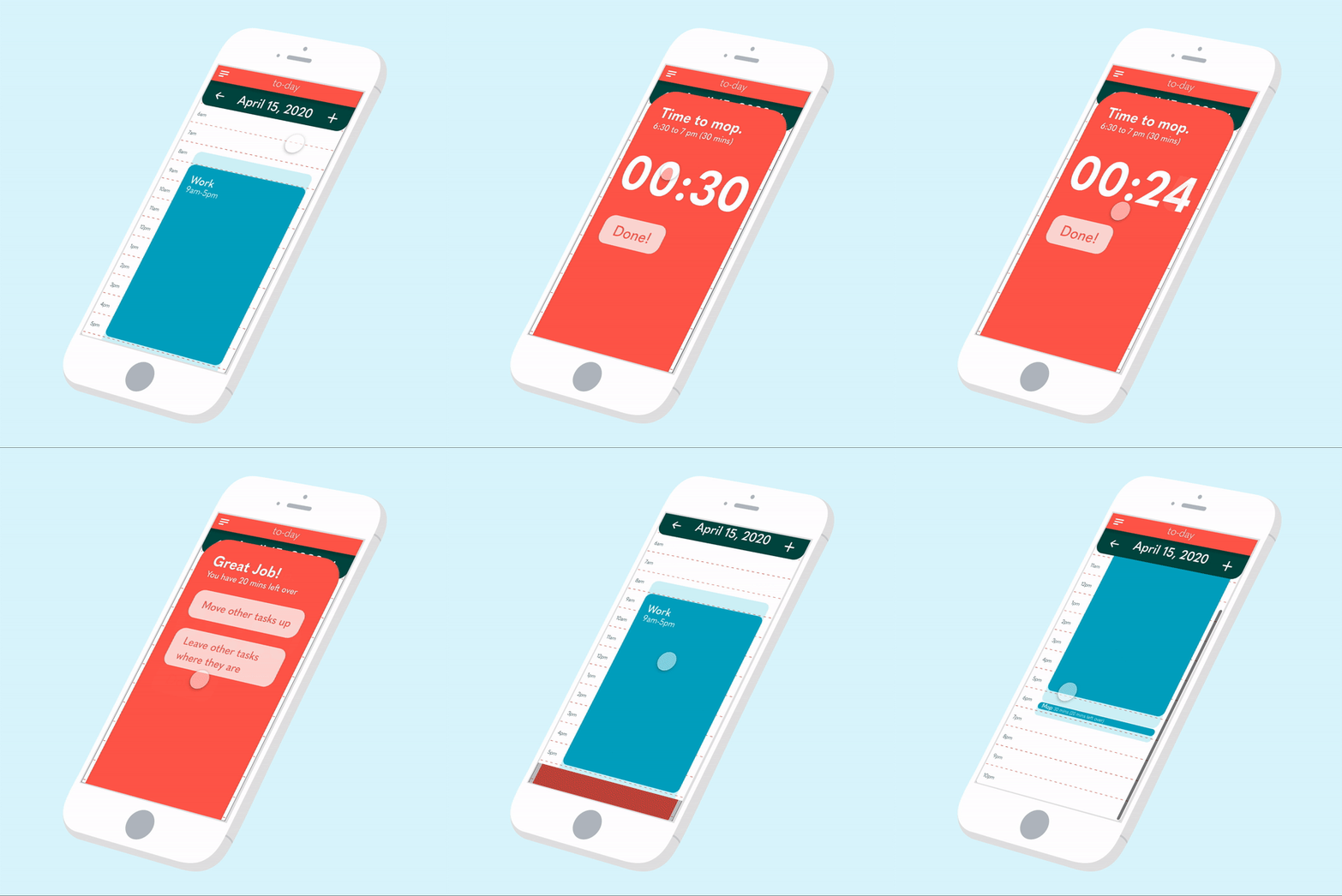
Something that you won’t find elsewhere is To-day’s preset library, a completely customizable catalog of daily tasks that you can drag and drop on your calendar. All tasks are editable, to fully customize your day-planning experience. You may notice, that not only can you not drop this task on top of work, but you also can not place it on top of the time bumpers.
Completing a Task
Now it’s time to complete a task. When it hits time to start a task, a notification is sent and a pop-up slides up to prompt you to begin. Once you begin, a timer starts. At any time, if you finish early, you are able to end the task. Once the task is ended, you are able to choose whether you want to keep your other tasks for the day where they are or to move your other tasks up by the remaining time. In this case, we choose to keep the remaining tasks where they are and we can see that there is now a time bumper where the remaining 20 minutes would be.
Using the To-Do List
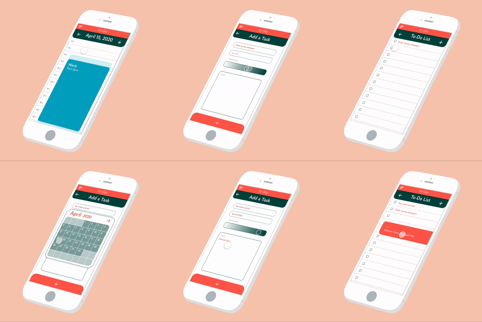
Under the drop-down menu on the top of the screen is your to-do list. An intuitive feature of To-Day is the priority level bar. By dragging towards the darker end of the bar, you set the task at a higher priority, and by dragging in the opposite direction, a lower priority. The app automatically orders the tasks on your to-do list based on their placement on the gradient scale, making it effortless for the user. By adding a due date, the app chooses the priority level based on how soon it is. By clicking on the task, the notes are shown.


